Personalized trip planning application
TripCraft
Duration
7 weeks
ROLE
UX Designer
EXPERTISE
User Research
UX Design
Prototyping
Usability Testing
User Interface
Team
Just me :)

About
TripCraft is a personalized trip-planning app that helps users create a custom itinerary based on their budget and preferences. The app suggests activity, transportation, and accommodation, and collects data through a series of questions to prioritize the suggestions.
Problem
Planning a trip can be overwhelming, and time-consuming, and often results in generic itineraries that don't truly reflect the traveler's unique preferences. The personalization on the current travel planning websites or applications are limited to the user’s budget and time/days for the trip.
Solution
This is where TripCraft, an app I designed, comes in – an innovative solution to revolutionize the trip planning experience. Counting personality traits such as being a morning person, prioritizing local food, or having different budgets for stay and food, TripCraft solves this issue by integrating AI.
Proposal
TripCraft lets the users create a personalized itinerary for their trip, suggest activities and modes of transportation, and help them with lodgings, meals, etc., based on their budget and preferences. The app will collect data about the user's preferences through a series of questions and then prioritize the suggestions accordingly. The app focuses on providing users with a seamless and stress-free experience. Instead of manually planning every trip detail, users simply answer a few questions and let the app generate an itinerary based on their answers. The user then easily edits the itinerary, ensuring that it is tailored to their exact specifications.
How it works

The user is interested in planning a trip

TripCraft recommends destinations tailored to user preferences

TripCraft helps to choose activities based on user enjoys

The user gets a personalized itinerary
Scope
Competitive Analysis
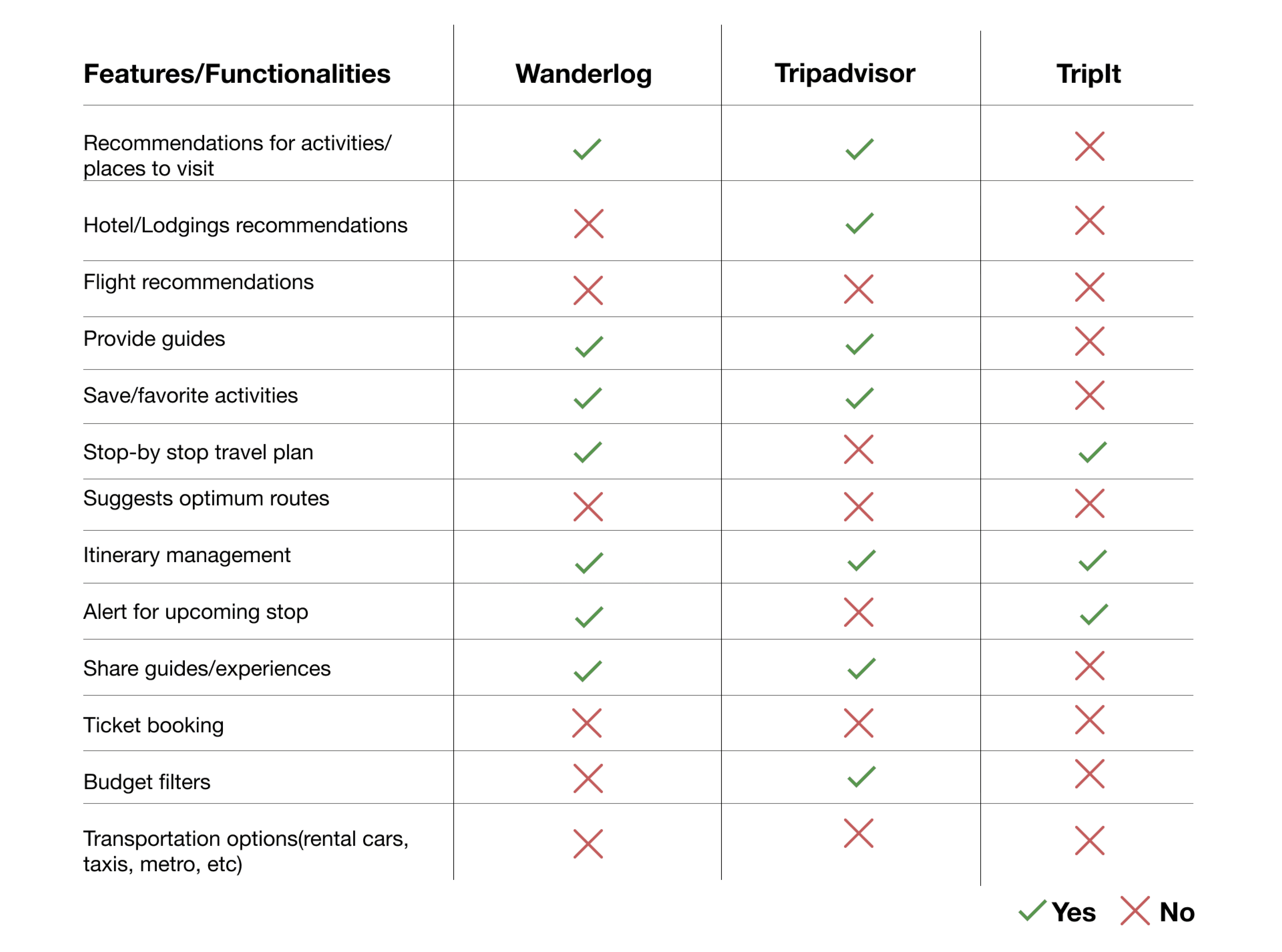
For this study, I choose the apps that are providing services close to what I am proposing. I did a detailed analysis of the apps - TripIt, Tripadvisor, and Wanderlog. They have the highest rating on Google Play store as well as Apple App store, and fall under the category of trip organizer apps which is where my focus is, rather than booking.
Wanderlog
Best for creating detailed itineraries, good for recommendations of selective things
Tripadvisor
Best for recommendations and exploration
Best for itinerary management and syncing information
User Research
For this study, I choose the apps that are providing services close to what I am proposing. I did a detailed analysis of the apps - TripIt, Tripadvisor, and Wanderlog. They have the highest rating on Google Play store as well as Apple App store, and fall under the category of trip organizer apps which is where my focus is, rather than booking.
Almost 50% of the participants travel 3 times or more in a year.
Almost 93% of the participants like to travel in a group, however, only 79% of them like to plan the trip/ make decisions for the trip in a group.
Everyone plans their transportation, activities, and stay prior to the trip. 46% of participants plan their meals too.
Before booking lodgings, almost 90% of the participants look for ratings, reviews, and price. Almost 60% of the participants also check rooms, proximity, and service.
Participants have mixed opinions about needing a guide before a trip.
83% participants opt they will or might consider sharing their travel experience with others.
Participants use travel planning apps like Trip advisor and Makemytrip mostly. Along with Expedia, Kayak, Airbnb, and Agoda.
A feature to plan multiple itineraries at the same time as well as archive the old ones for reference.
A feature where they can share the itineraries among friends, take suggestions, and edit collectively but they would have a Primary user who will have a final say, a bit more control.
Flexibility to be spontaneous with their food. Real time recommendations while the trip is on-going based on location is necessary.
Information like ratings, reviews, and price should be represented along with the name of the place in the list view. The information such as room pictures, proximity from a certain place, their service, or whether they are pet-friendly, could be mentioned on a detailed page about the place.
The guide can be represented in a different section which users can access if they need to (below on the homepage or on a different page accessible from homepage)
A blog feature to share their experiences and itinerary before the trip to gather useful suggestions from fellow travelers.
Except TripAdvisor, all of these apps are more focused on booking flights, and hotels, and fixing the plan, instead of making one. While TripAdvisor is focused on providing recommendations. Thus, this gap can be filled by TripCraft.
Findings
People who like to travel among the age group 18 to 35 years and like to use an app/website to plan an itinerary for their trip.
To plan a personalized trip with ease.
To provide a tailored itinerary that is editable based on budget, proximity, preferences, etc.
To provide in-app suggestions with enough information to make decisions.
To access offline maps, collaborate with their friends/group easily through the app.
To access guides and share traveling experiences in a blog format.
The participants stated that they plan their trips to achieve specific goals such as organized trips, security, cheaper deals, being informed, not missing out on specific activities, and comfort.
Participants mentioned the best feature of the travel apps they are currently using - cheap deals, discount information, ratings, flight options, and real-time location on map.
Frustrations while using other travel apps - apps being not user-friendly, unsatisfactory search results, multiple apps for different things as there are no singular apps for everything, misleading information, no offline maps, and having to collaborate manually through calls with the group to discuss the itinerary.
Design
After completing the user research phase, I transitioned seamlessly into the development of the app. Drawing insights from both user research and competitive analysis, I outlined the following key features:
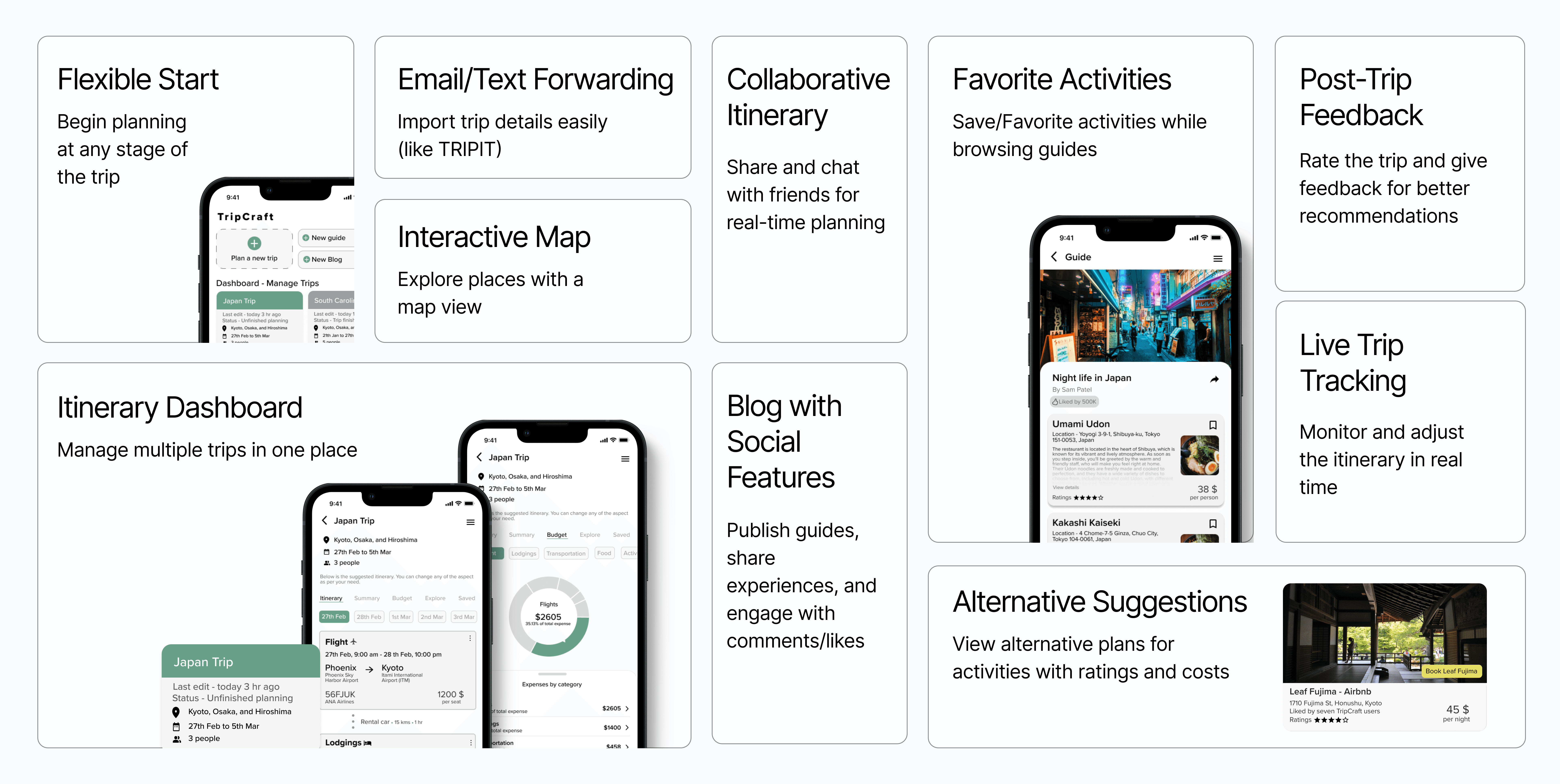
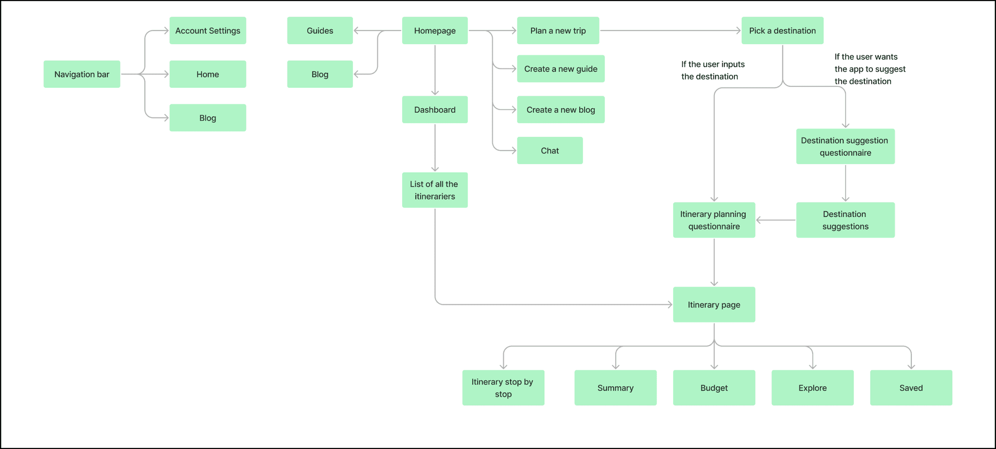
Information Architecture
With a clear understanding of user needs and market demands, I moved on to brainstorming the information architecture. This step was crucial in structuring the app's content and navigation, ensuring a seamless and intuitive user experience. The figure below also showcases the scenarios of how a user can start their itinerary planning at this stage of the process.
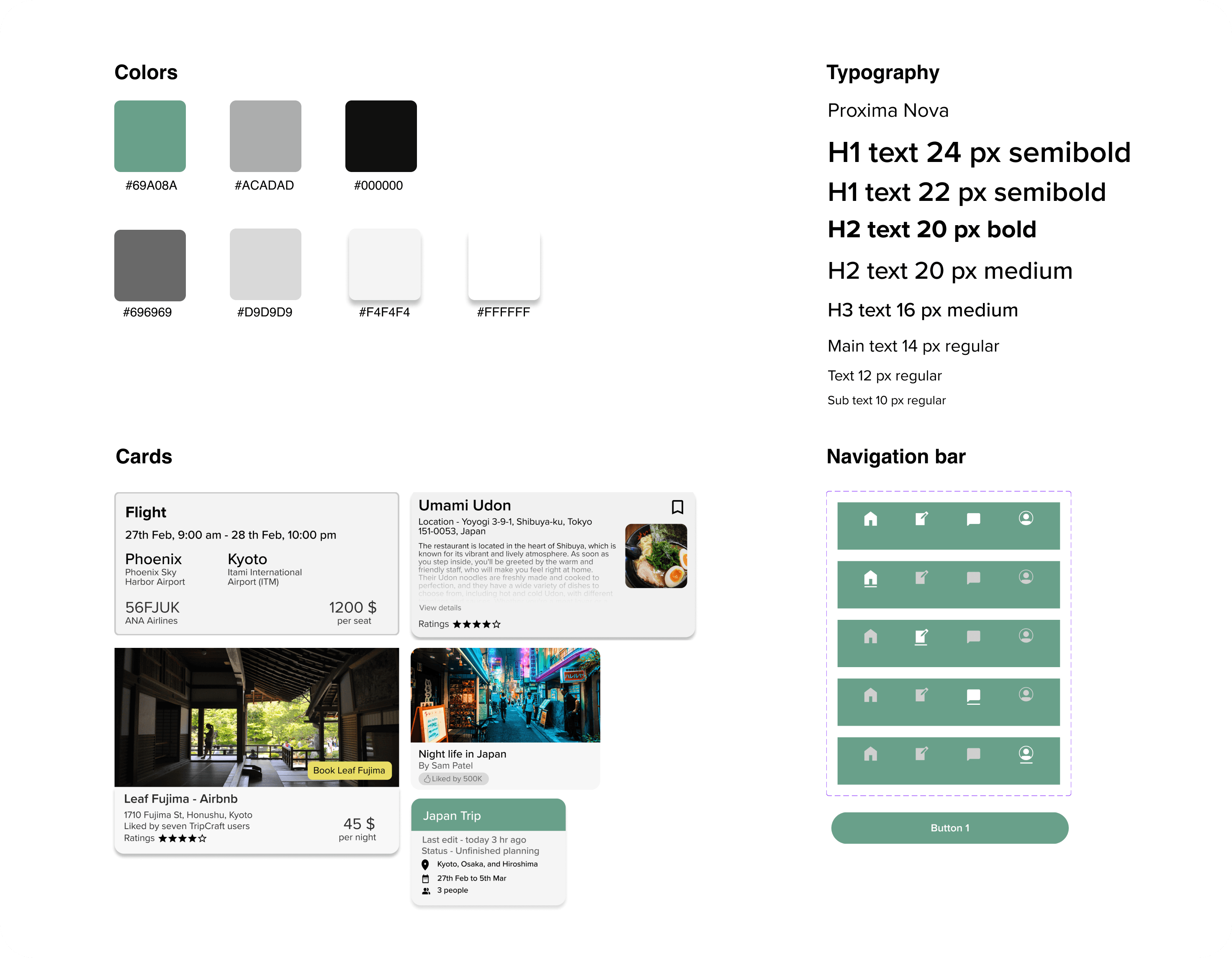
Style Guide
For this study, I choose the apps that are providing services close to what I am proposing. I did a detailed analysis of the apps - TripIt, Tripadvisor, and Wanderlog.
Solution
The resulting AI-powered scheduling app offers a seamless user experience, allowing individuals and businesses to effortlessly manage their schedules.
Wireframe
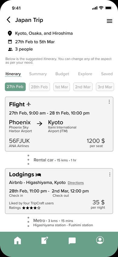
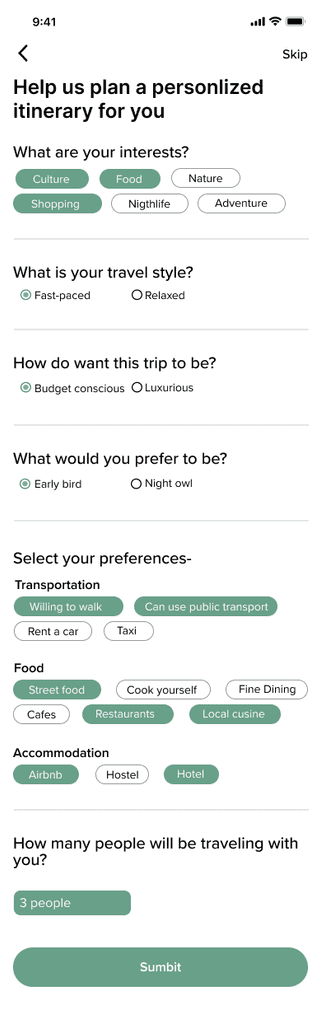
Itinerary creation process
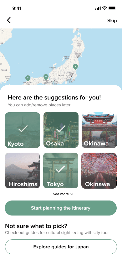
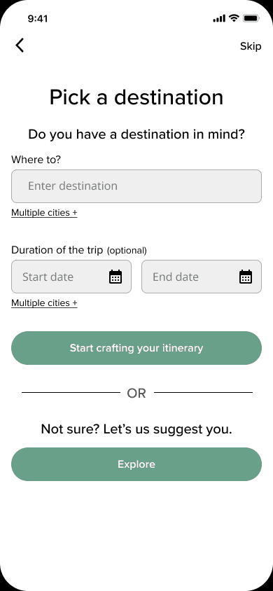
Users can pick a destination, if they have already decided or they can let the app suggest them. The users will have to fill out questionnaires focusing based on what they want to do on this trip, what they enjoy, what activities gives them joy, and the app will provide a list of destinations for them. Further on, the app will provide them an itinerary customized to their preferences, unique to them. If the user wants to edit the itinerary, they can. The application will provide suggestions for the same.

Itinerary pages
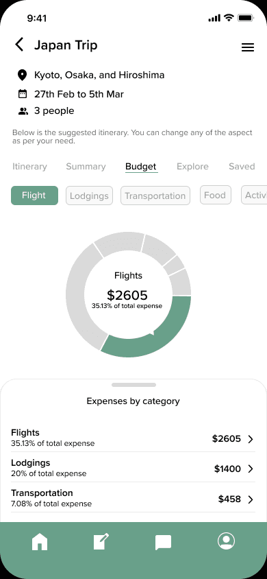
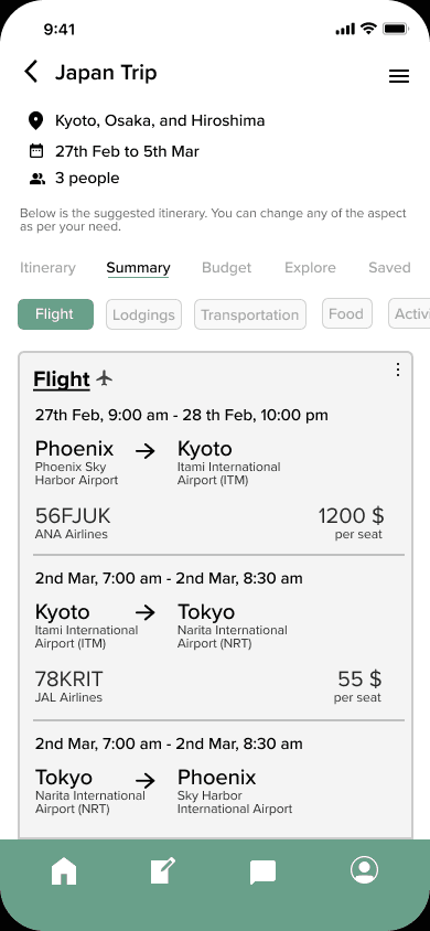
The itinerary can be view with information categorized based on the needs. The itinerary page shows the step-by-step travel plan for the trip, with transportation, lodging, activities, and sight-seeing destinations. While the summary page shows the same through grouping the information for a overview. The budget page shows the detailed expenses chart.
Itinerary pages
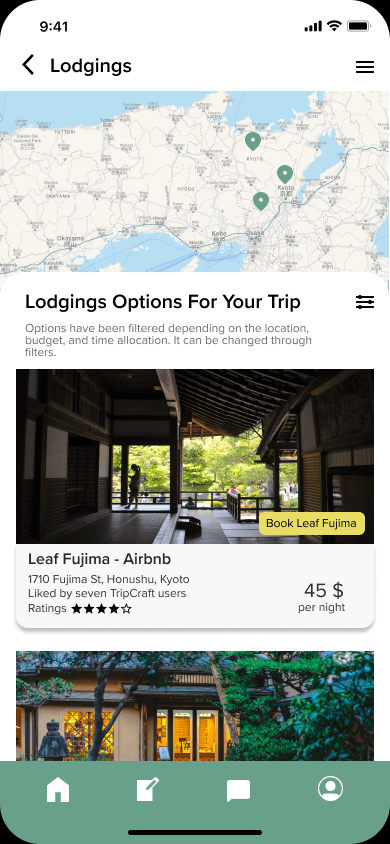
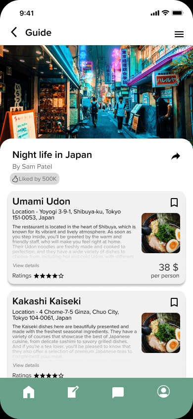
The homepage of the app features a dashboard that provides quick access to all of the user's itineraries, as well as a feature for saving activities and events. It lets users to access the guides made by community, also an opportunity to create their own guides and blogs to share with the community. The guide page offers users immense resources with ratings for them to explore. The app allows users to choose an alternative option if they are not satisfied with a suggestion, and provides a list of suitable alternatives with information such as ratings and costs. Users are then redirected to the relevant website to make a booking.
Testing
Five second rule test
Participants - 2
Testing medium - Conducted in-person with the use of a timer then asking questions and noting responses.
Screens tested - Homepage, Itinerary, and Summary
Data recorded - Response to post-test questionnaire
Post test inquiry focuses on what exactly catches the user's attention in those five seconds, can users figure out the purpose of the screen, and what is their first impression visually.
Usability testing
Participants - 5
Testing medium - Online through Zoom
Data recorded - User comments, task success, and response to post-test questionnaire.
Test procedure - I shared the tasks with the participants and timed each task. Three scenarios and 10 tasks were employed for this test. Post-test questionnaire was conducted to gather experiential data about the design, user flow, and usability of the app.
Conclusion
Here, the outcomes and achievements of the project are highlighted, including user feedback, adoption rates, and industry recognition.
Conclusion
While many users appreciated the app's ready-made itinerary feature, it became clear that some users prefer to create their itineraries from scratch. To accommodate these preferences, the app will introduce a manual itinerary creation feature that allows users to bypass the form-based questionnaire.
To improve navigation, the navigation bar will highlight the icons of the current page to reduce confusion. Additionally, the app's questionnaire will be made more interactive and engaging, encouraging users to provide more detailed preferences.
To enhance the usability of the itinerary and summary pages, sections will be designed to be collapsible, minimizing the amount of scrolling needed. The horizontal navigation bar will also be more prominently displayed to indicate that additional information is available.
A floating button will be added to the itinerary page to make it easier to edit or add new sections.
Lastly, to improve readability on the homepage, unnecessary information will be removed, and the font hierarchy will be adjusted for better clarity.
Learnings
I gained a good knowledge and experience of how to work on mobile application. I received an understanding of how to conduct competitive analysis and how to derive findings from survey results and to turn them into a list of features to include. Overall, I gained mastery on how to design an mobile app from concept to the end product.