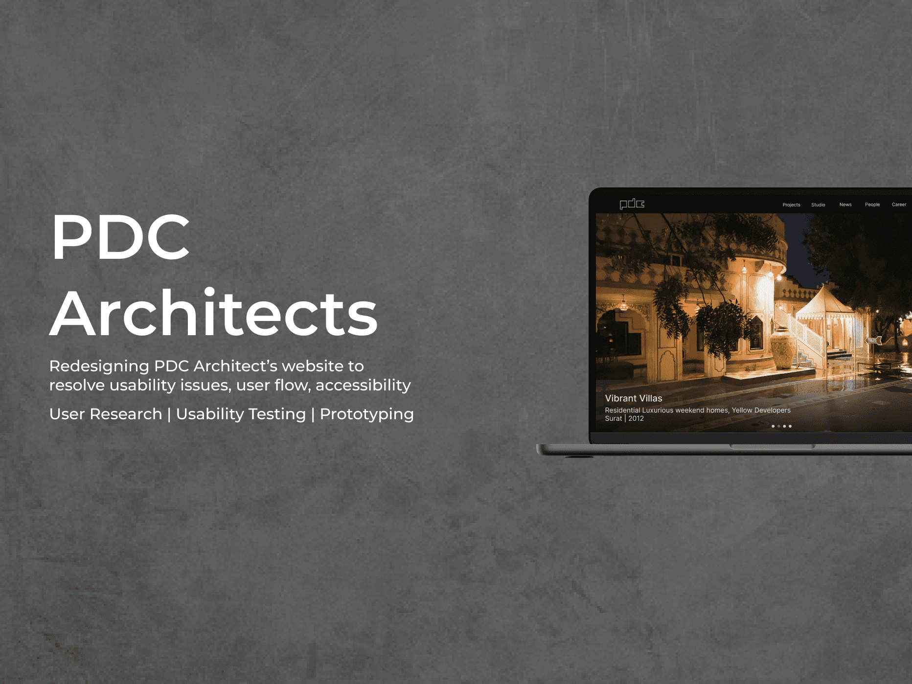
Website re-design to resolve usability issues
PDC Architects
Duration
7 weeks
ROLE
UX Designer
EXPERTISE
User Research
Heuristic Evaluation
UX Design
Prototyping
Usability Testing
Team
Just me :)

About
PDC Architects is an architectural firm in India. They are providing design solutions since 2007, specializing in residential, commercial, institutional, industrial, and recreational projects. Their website was evaluated to identify usability issues. Errors discovered were related to navigation, content, format, and accessibility. Recommendations for improvements were made and based on them, prototype was developed, which solved all of blocker, major, and minor issues, providing a richer user experience.
Problem
Architects aren’t allowed to advertise themselves in India. They can use a website to showcase their work, credibility, and ideology to build trust with potential clients and employees. A well-designed and user-friendly website can attract new business by converting website visitors into potential clients through effective design and user experience. The PDC Architects website makes it difficult for users to navigate, understand the information, and connect with the firm. Hindering the website's effectiveness and leading to a poor user experience.
Goals for usability testing
To know if users like/dislike the information representations and why.
To identify the usability of the navigation on the website.
To investigate user satisfaction and accessibility of the information on sections like people, news, design studio, and clientele.
To discover usability issue through user research, testing, and communication with the users.
Project Summary
During the initial audit of the website, several pain points regarding navigation, content, format, and accessibility, were discovered. Through employing the different methods of evaluations and user research such as Heuristic Evaluations and Survey, usability issues were analysed on an elemental level.
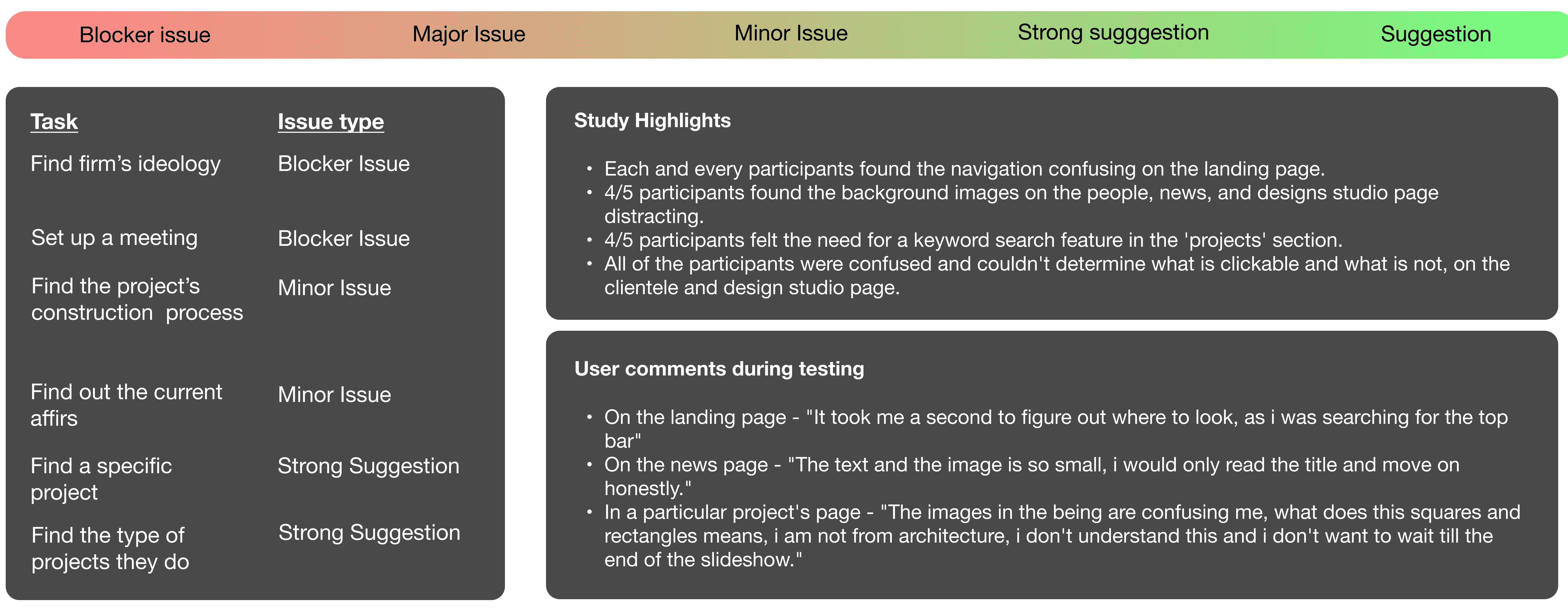
Usability testing - Major findings
The icon-shaped and unconventional navigation confuses users.
The homepage has readability issues. Users overlooked the ideology of the firm on the homepage.
On the news page, the article is shown in a text dialogue box with an image that looks clickable but isn’t. The readability is poor, and the article is not informative enough.
The contact page does not show any error if the user mistypes their email ID or a wrong input which results in users waiting for a reply from the firm.
Recommendations proposed through redesign
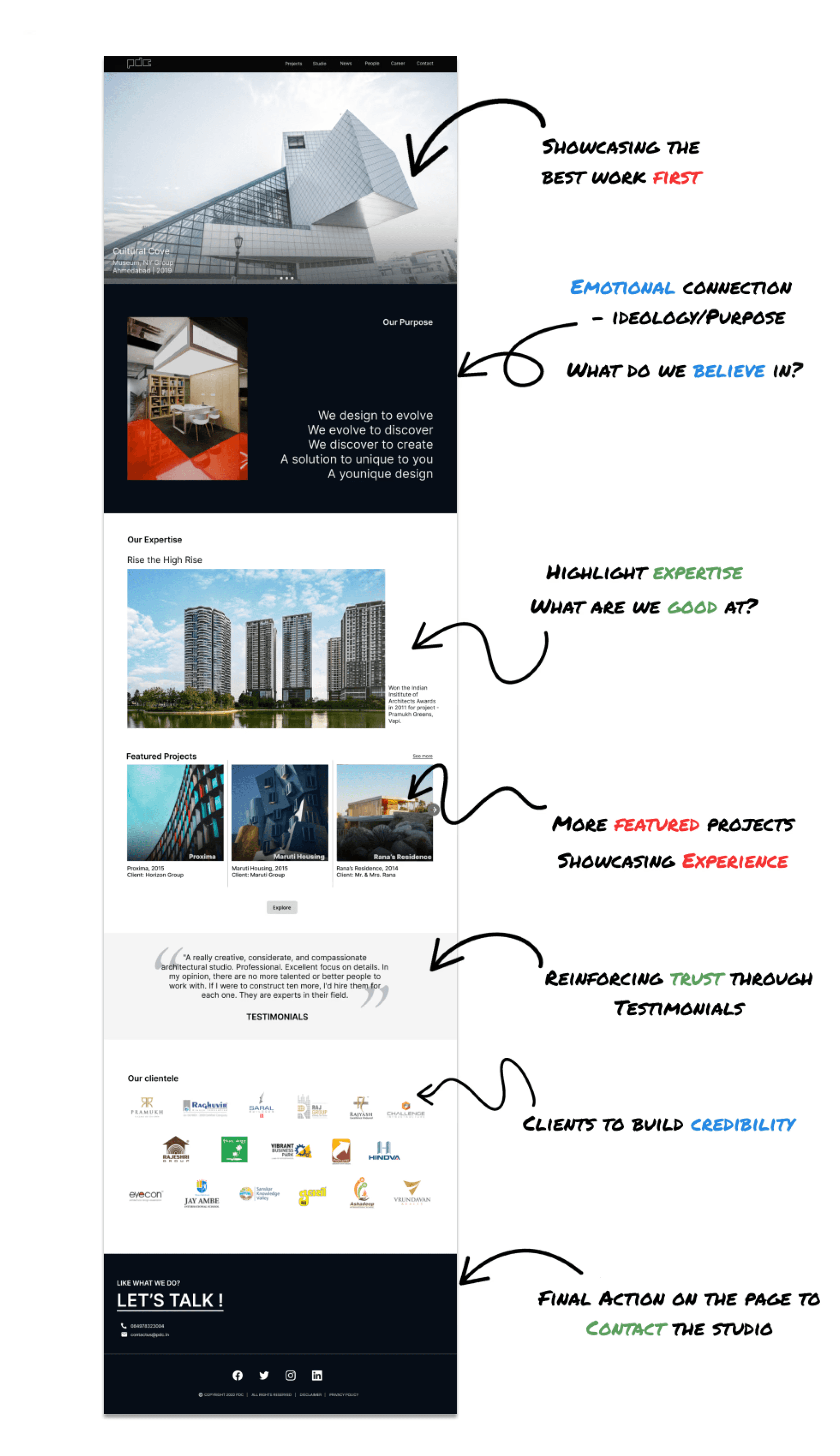
A navigation bar on the top of the homepage was added.
The ideology of the firm was shifted below the carousel and is highlighted.
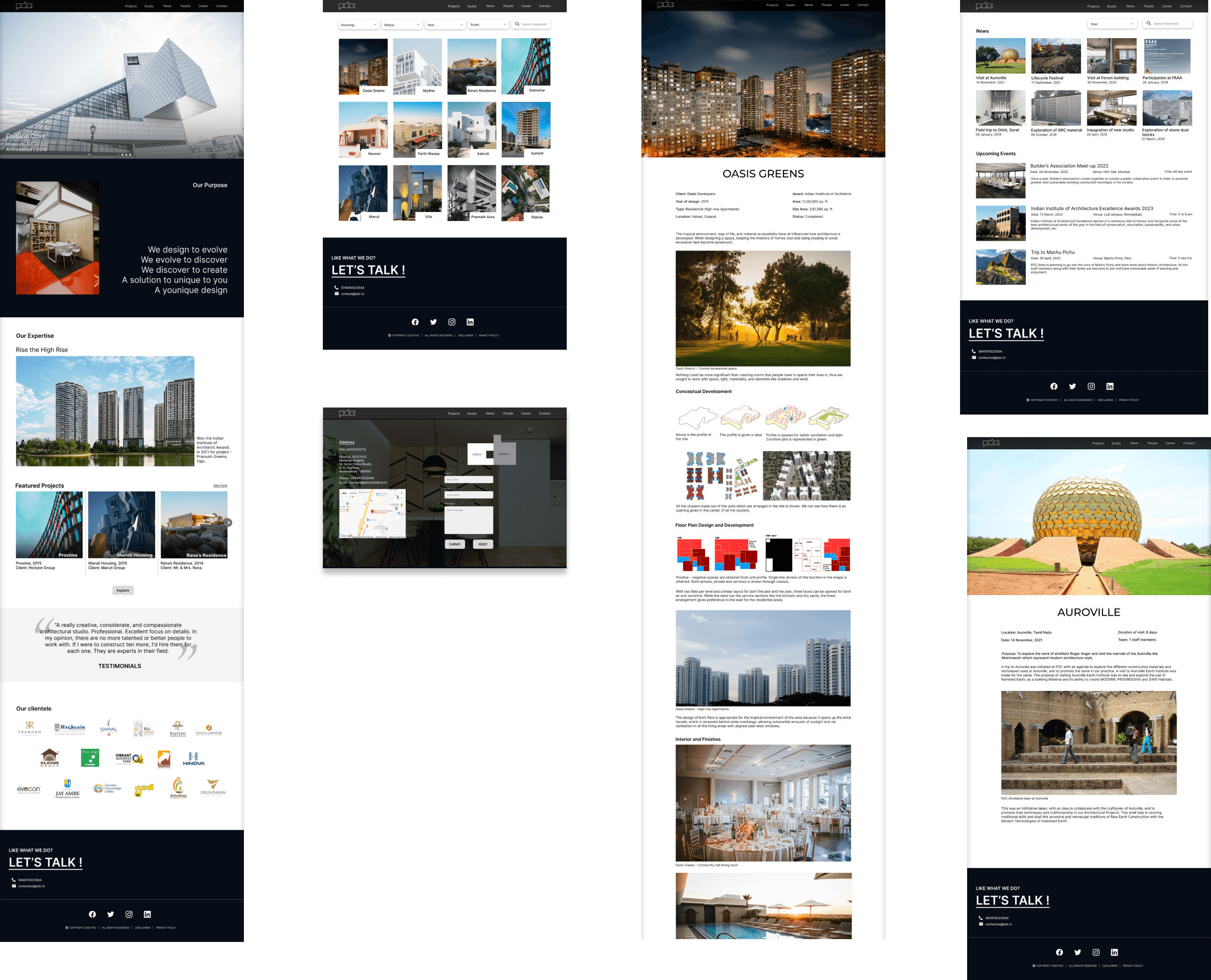
The news page is redesigned and split up into two pages. The icons are clickable which leads them to a full-size descriptive article. The page represents future events too.
The contact page now has an added alert feature. When the users mistype their email, an error in red appears below their text box to alert them.
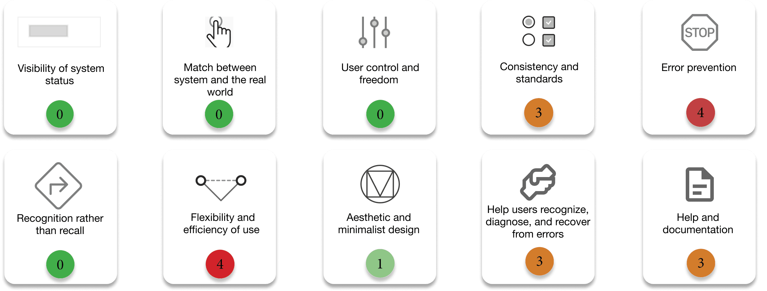
Heuristic Evaluation
The Heuristic Evaluation of the website was conducted to discover and understand usability issues at the elemental level. The evaluation was based on Jacob Nielsen’s 10 Usability tests and measured on Jacob Nielsen’s Severity Scale.
Jacob Nielsen’s Severity Scale

Jacob Nielsen’s 10 Usability Tests
User Research
The aim of the user research was to identify the target audience and get to know more about the users. It contains a preliminary online survey, personas and user stories, and usability testing.
Preliminary Online survey
An online survey was conducted with 10 participants who answered questions about demographics, design preferences, content, and functionality. The participants belong to age groups 19-25 and 26-35, while their occupation was being a student, architect, or designer.
Pain points derived from the survey
Unconventional navigation and landing pages create user confusion.
'News' page articles are misleadingly presented in dialog boxes; the news section is outdated.
Text bubble format for articles adds friction, discouraging user engagement.
The project slideshow lacks captions, hindering specific area identification.
Multiple clicks are required to view all project images; improved arrangement is needed.
Segregating data with corresponding images could enhance project storyline understanding.
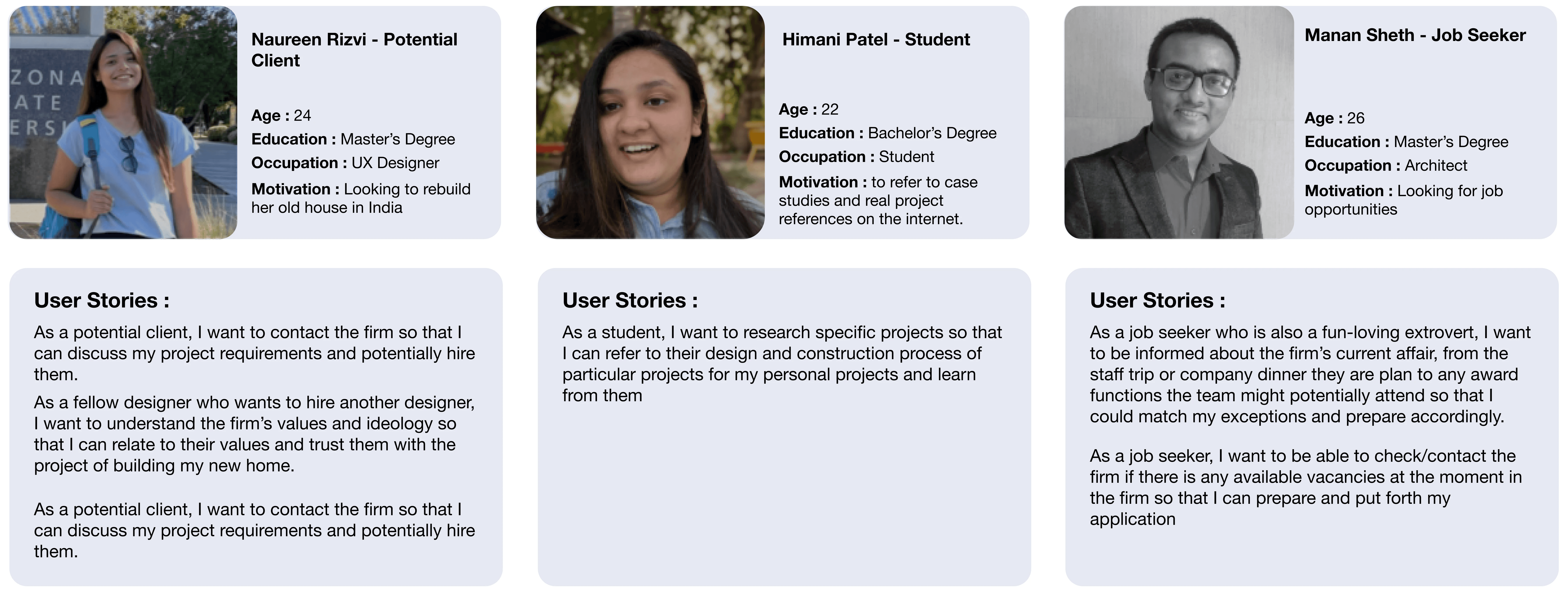
Persona and User stories
The major target audience of the website was - potential clients, architecture students, and job seekers. Three personas elaborating on goals, needs, pain points, and motivation of users, were formed. User Stories addressing each user goal for every persona were written.
Usability Testing
The testing was conducted for a total of 10 tasks which are based in scenarios, and scenarios are based on the user stories selected in the pre-testing preparation.
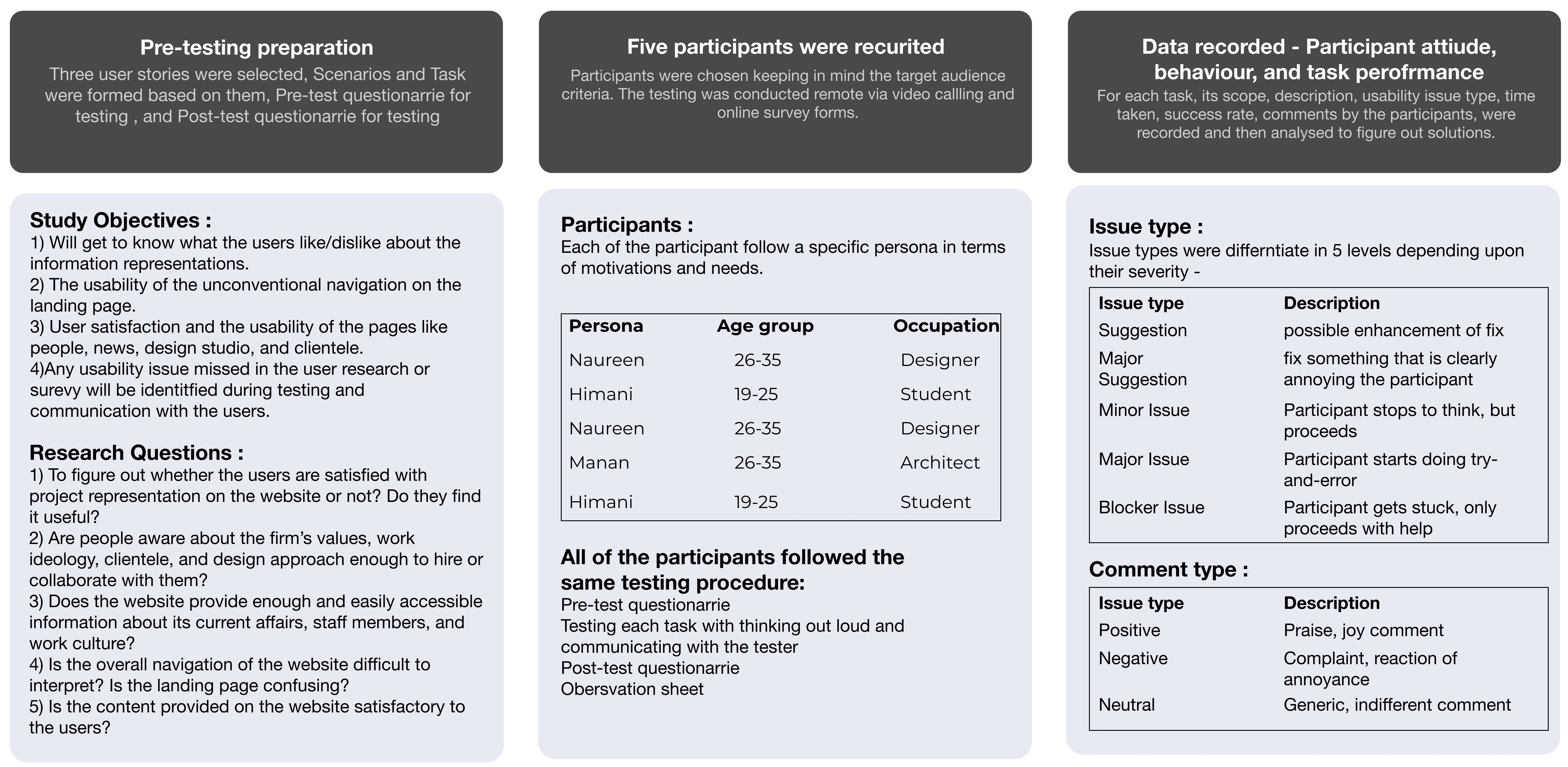
Results
The success rate and average time taken to accomplish the task is calculated. From this data, the impact of each usability issue on the user experience is determined as issue type to showcase severity.
Design
Navigation was reorganized and new pages were added to address gaps in the original website. Usability issues and recommendations focused on 'Contact', 'Projects', and 'News' pages.
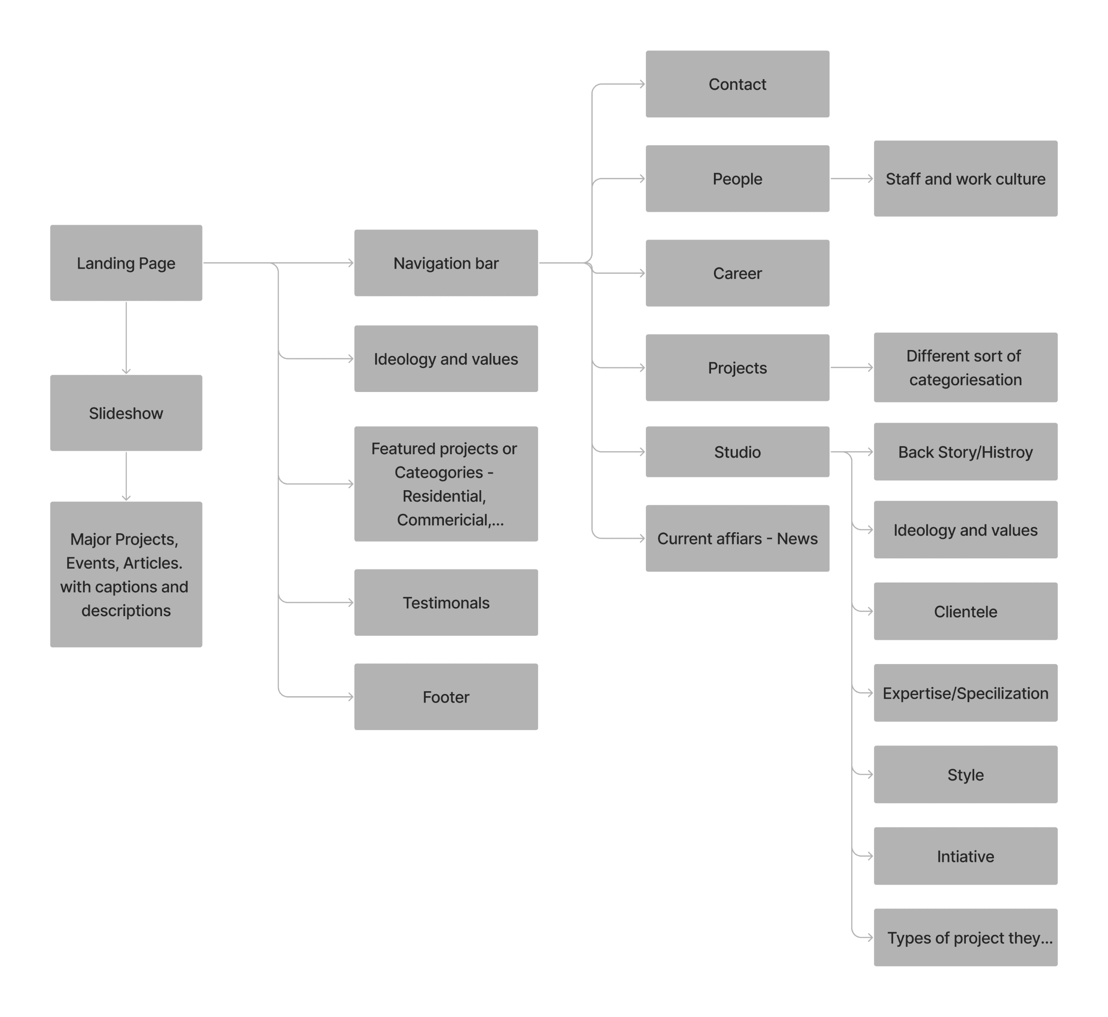
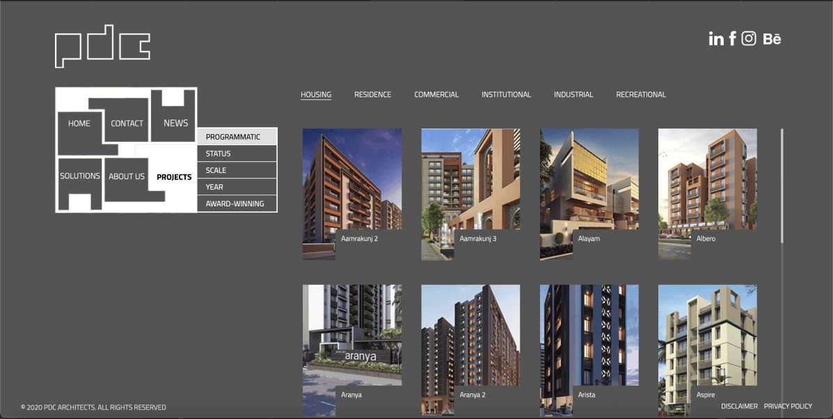
Wireframe
To improve usability, data was reorganized and icons/images were clearly distinguished as clickable or unclickable. The carousel on the homepage was retained, but the information was moved for better readability.
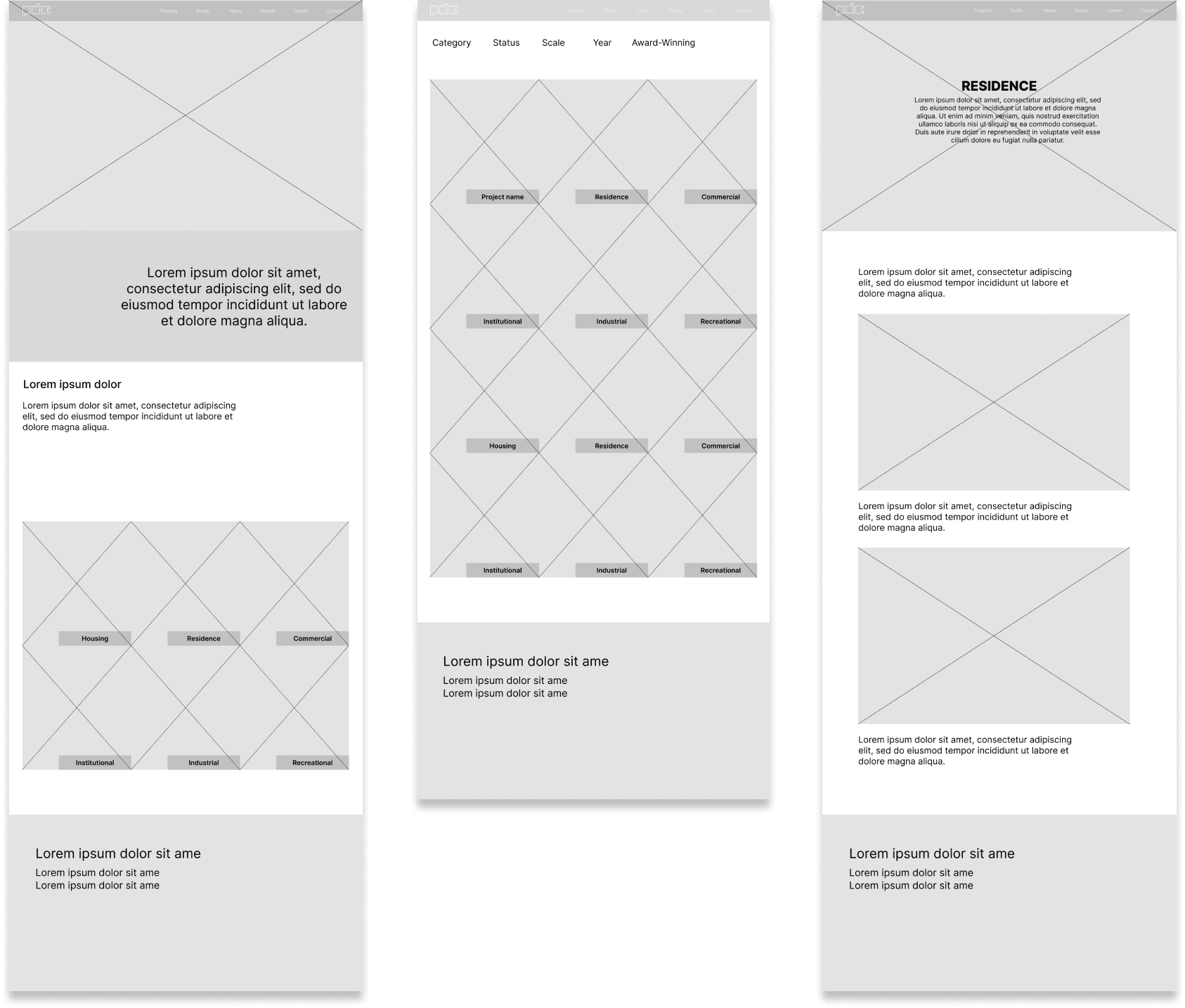
High-fidelity Wireframe
Hierarchy on Homepage
The homepage is designed to guide users through a curated experience, gradually revealing more information about the firm and building emotional connection and trust.
Recommendations
The website redesign was based on the recommendations that aimed to solve the issues discovered in heuristic evaluation, user research, and usability testing. The recommendations are listed below -
Blocker issue - 80% of the users couldn’t find the ideology of the firm during testing, thus being unaware of the firm’s purpose and unable to connect with them.
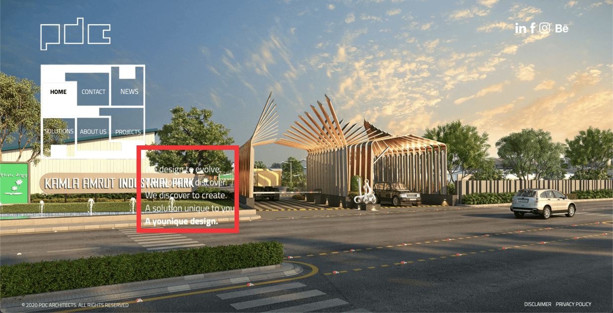
Old Homepage
Solution - The firm’s purpose/ideology is represented on the home page, below the carousel, and labeled accordingly. jhdbdhbdcbhcbcbc
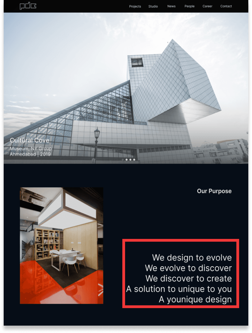
New Homepage
Major issue - The unconventional navigation caused readability issues. Usability testing revealed participants expected a top navigation bar and attempted to scroll down to find it.
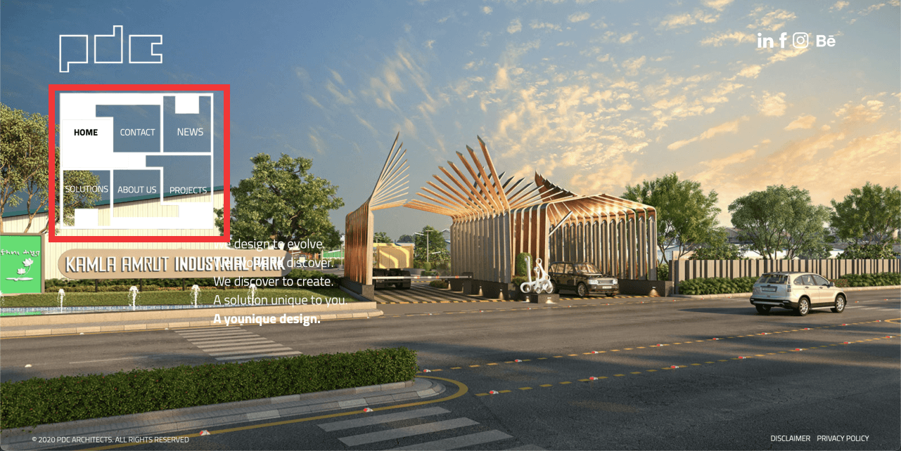
Old Homepage
Solution - Provide a conventional top navigation bar along with a down arrow on the carousel to indicate that there is more below on the home page, and the users should scroll down.
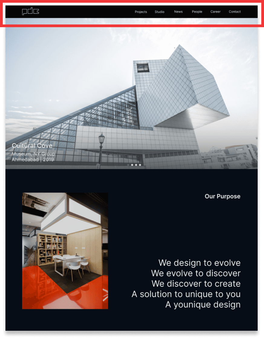
New Homepage
Suggestion - To search for a project from its name quickly, a keyword search feature is needed.
Old Homepage
Solution - A keyword search bar is provided. jhjfghfhchccncnccvnnvnnv
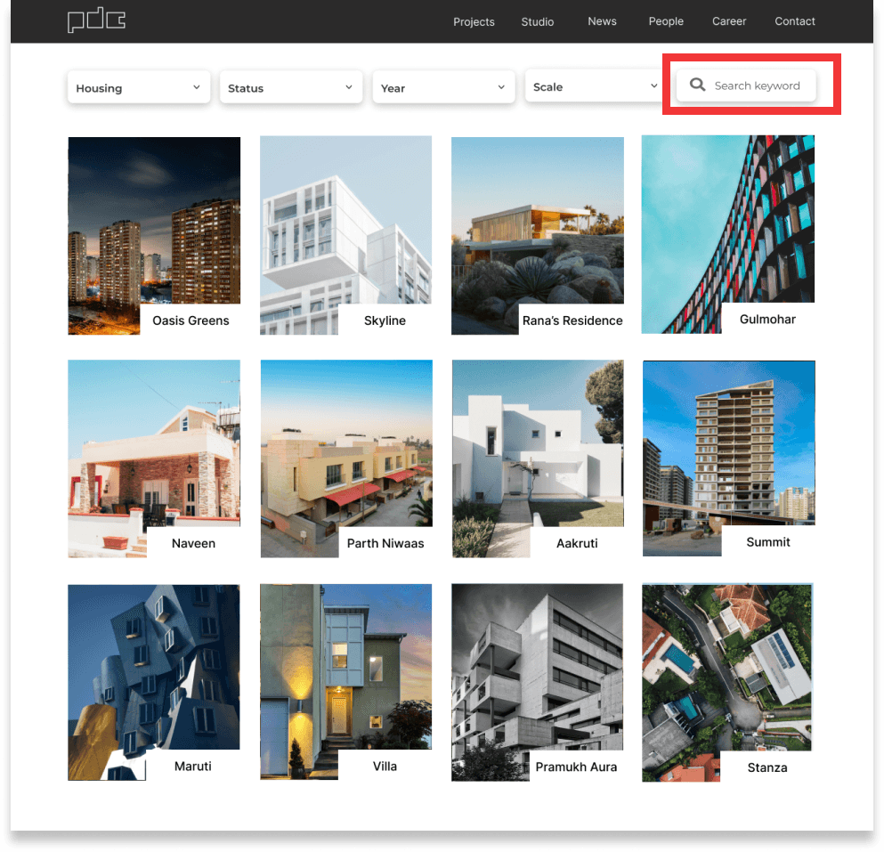
New Homepage
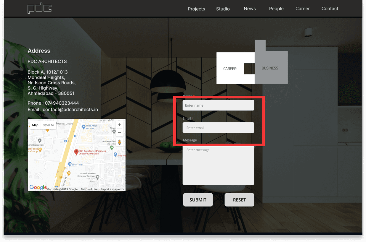
Blocker issue - There were no error messages, in case, any user inputs incorrect data. The process will end on a thank you page with the incorrect email format.
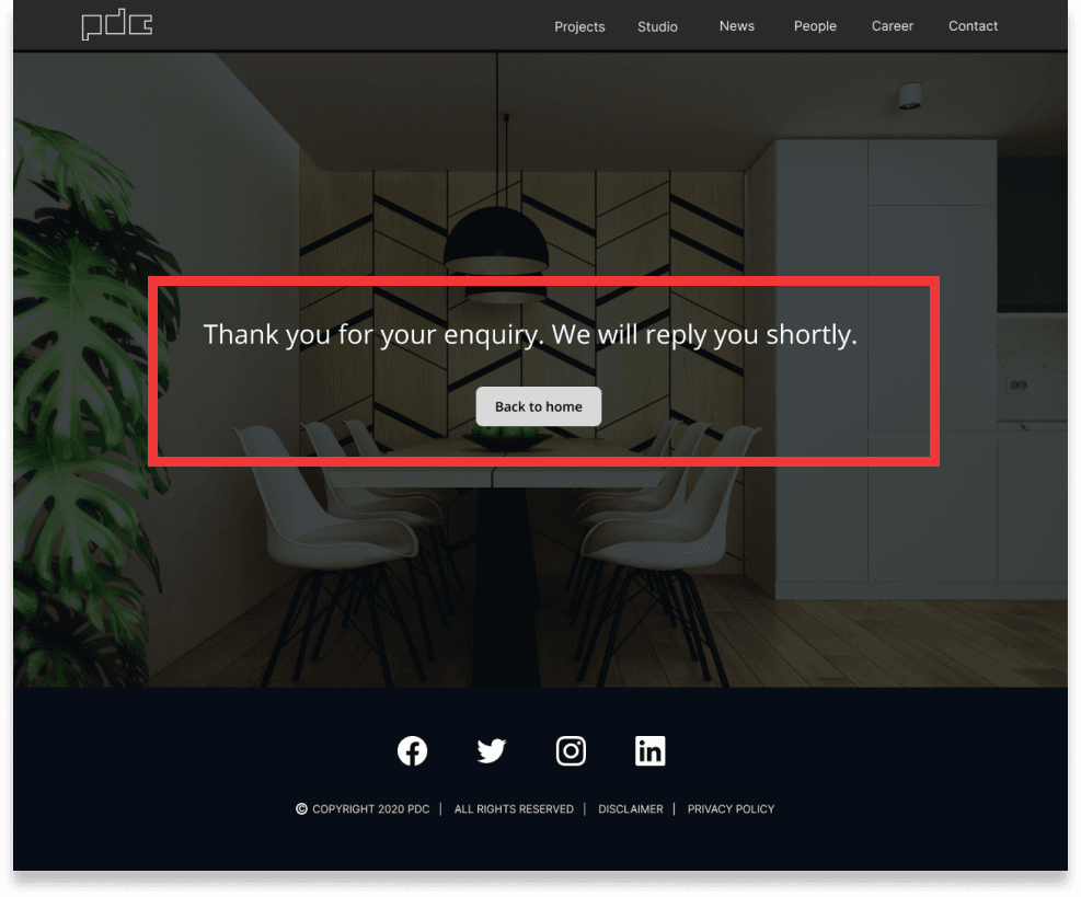
Old Homepage
Solution - An error message is displayed below the text field to show errors and provide the opportunity to correct them. A confirmation message is displayed to assure the users after sending the message.
New Homepage
Minor issue - The small dialog box and distracting background image made the articles difficult to read, and 4/5 participants reported that they would not be interested in reading the articles due to the cramped layout and small fonts.
Old Homepage
Solution - The News page now has bigger icons with headlines. Upon clicking on them, users can find a more descriptive article with all the information. Upcoming events are also shown on the page.
New Homepage
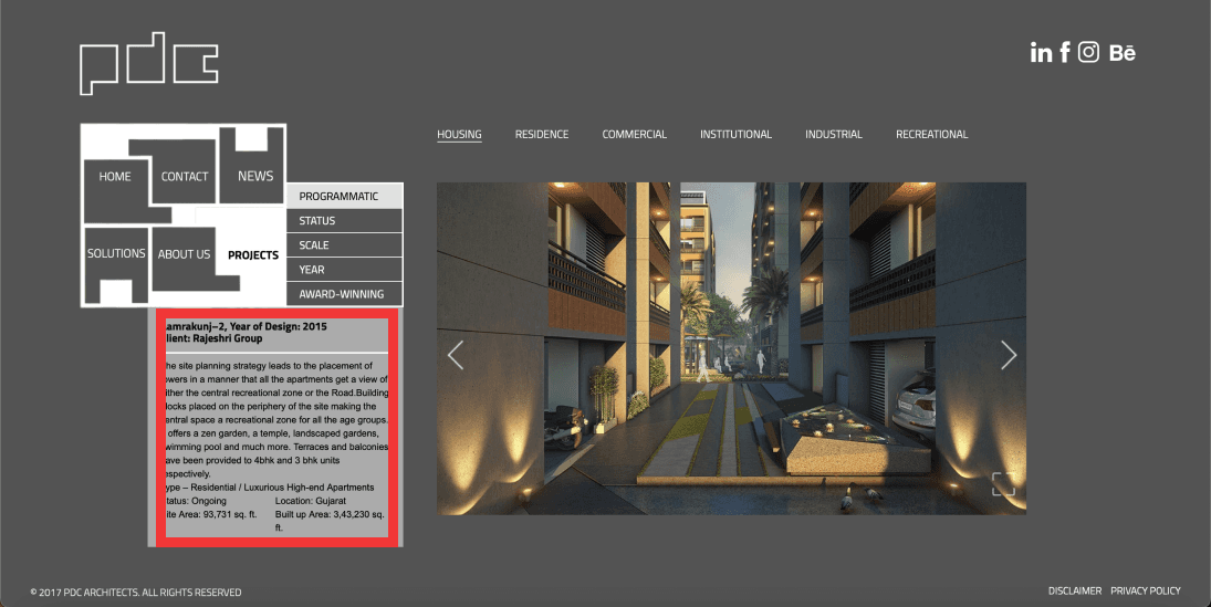
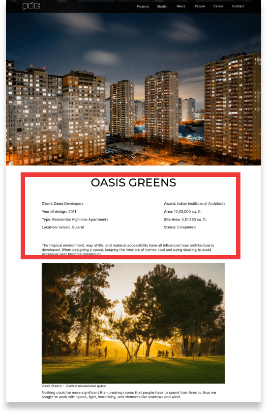
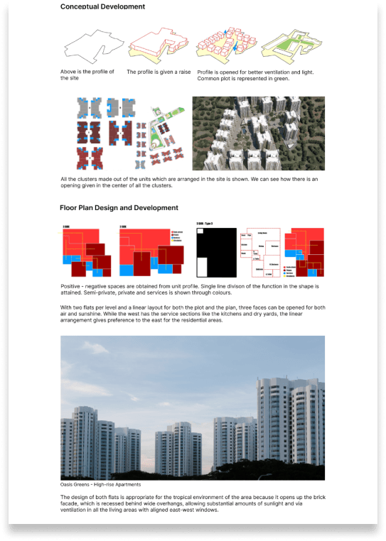
Minor issue - The project description is an unorganized paragraph with different kinds of information and the slide show shows the concept without any connection between the write-up and images.
Old Homepage
New Homepage
Conclusion
Implementing key findings
Significant usability issues were in areas of readability, format, organization of information, error detection, and unintuitive navigation. Recommendations to solve those issues that were presented in this case study should be implemented.
Add recommended pages
During the initial survey, there were gaps in the information provided on the website. To make user flow more seamless and intuitive, the recommended pages - Studio, Career, and People, should be added along with the necessary information.
Test, Iterate, Launch
The redesigned website will be tested for issues, iterated to address those issues, and retested until a launch-ready and satisfactory result is achieved.